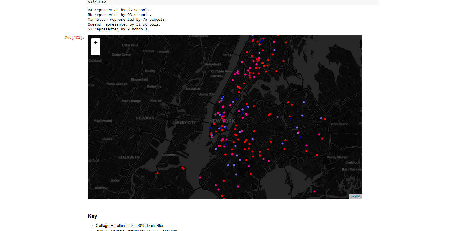

I've always known that a lot of students from NYC public schools, specifically those from my neighborhood, do not pursue college or graduate due to several factors. After discovering data about this, I felt drawn to make a simple but powerful visual representing this.
How I Started
This is a data visualization made out of the statistics showing how many, and more importantly, from where, NYC high school students go on to study higher education.
How I Built This
I downloaded two data sets, one that only had the DBN codes associated with the schools along with the statistics of college enrollment, and another which was a directory of high schools (name, street address, city..etc). Using Python and the data analysis library, Pandas, I combined what I needed from the two and then converted each address into coordinates using Google’s Geocoding API. After laying out a map using the folium library, I mapped each school into NYC based on their coordinates and color coded them based on their college enrollment, thus painting an image out of the data. The project took me about a week since I also learned the libraries and used a Jupyter notebook for it.